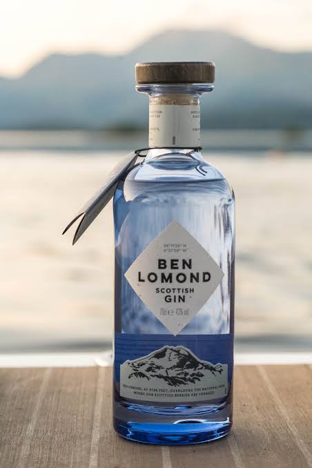
When a customer scans the shelf, your label has just a few seconds to grab their attention. Studies show product packaging, especially the label, plays a critical role in first impressions and purchasing decisions.
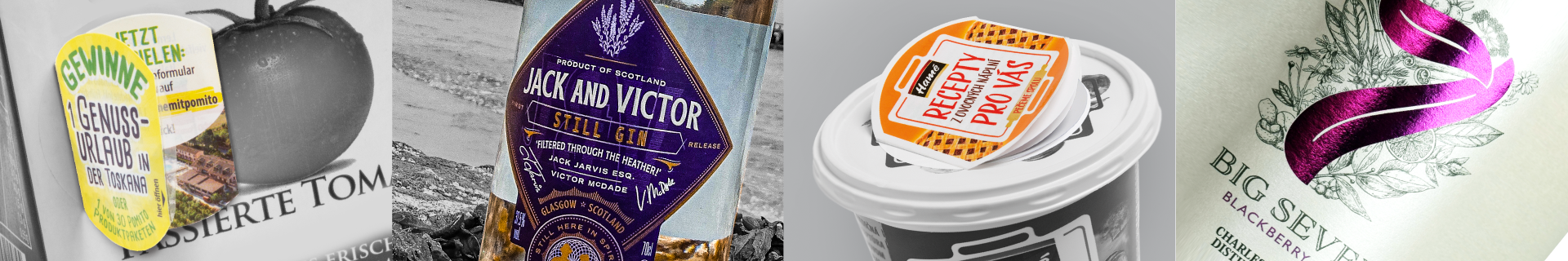
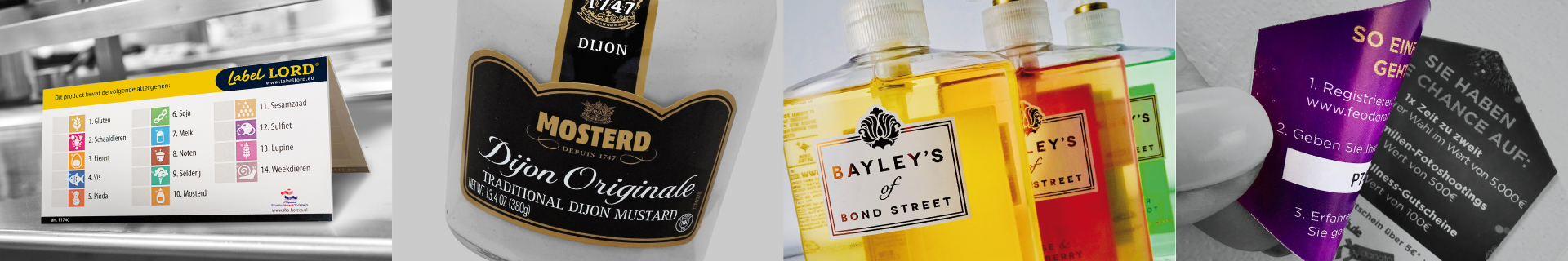
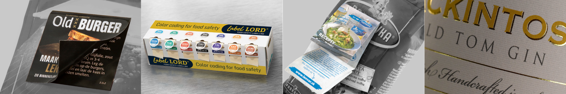
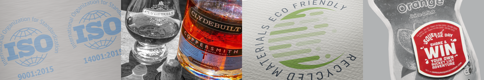
Design is key. Eye-catching colour, clear fonts, and quality finishes communicate professionalism and product value. Features like metallic foils, matte varnishes, or soft-touch laminates don’t just look premium, they signal quality to the customer. Even subtle upgrades to texture or clarity can improve perceived value and increase shelf appeal.
That’s why our in-house design team works closely with clients to develop or refine label artwork that’s both visually effective and production-ready. We guide choices on layout, finishes, materials, and colour so your label performs as well in print as it does on screen.
We also help brands avoid common pitfalls, like illegible fonts, poor contrast, or finishes that don’t hold up under moisture or handling. A beautiful label is only effective if it still looks great when the product reaches the customer.
The result? Better engagement, stronger brand recognition, and a greater chance of winning the sale, especially in competitive markets like cosmetics, food, and health products.
If your label doesn’t reflect the quality of what’s inside, it might be time for a refresh!